Reminder app for ArtCenter students.
Research – Concept – Prototype
timelapse
Eighty percent of life is showing up.
— Woody Allen
My Role
30%
User Research70%
User Interface Designbrightness_3
timer
brightness_5
Participatory Research
Public Survey
Starting with the broadest of strokes, I initiated my research by posting surveys around campus asking students what kinds of reminder they want to have on the app.
I quickly learned that beside getting reminders for their class time, students also want to be notified of other social and professional activities on campus.
I developed a subscription model for signing up to receive reminders and alerts for classes and events happening around campus.
arrow_downward
Early Prototypes
Participatory Design
I asked several other students to jump in on impromptu co-design sessions where we made quick prototypes using pen & paper.
After several iterations, patterns started to emerge from the chaos.
arrow_downward
40%
Creating alarms
40%
Adjusting alarms
20%
Removing alarms
keyboard_arrow_up Distribution of time spent inside an alarm app
Economy of Scale
If I can help a student shave just 1 or 2 minutes off the time they'd spent preparing for school, imagine how much time would be saved for the entire student body, over the course of 8 terms?
Seeing the big picture, I aligned the project’s success metrics along 2 key performance indicators.
arrow_downward
timer
Efficiency
- Measured in the amount of time spent completing a task
- Repetitive ‘chores’ should be avoided
- Scalable, working model for 95% of users
done_all
Ease of Use
- Best represented by the number and complexity of steps required to complete core tasks
- Each step should entail little to low mental effort
- Smooth learning curve among new users
keyboard_arrow_up Key performance indicators
Task #1
Adding alarms
keyboard_arrow_down Before: adding all alarms took 6+ steps
Login
Navigate to schedule
View course schedule
Create alarm
Edit alarm
Finish
keyboard_arrow_down After: the same task only required 3 steps
Login
Edit alarms
Finish
all_inclusive
One Account To Rule Them All
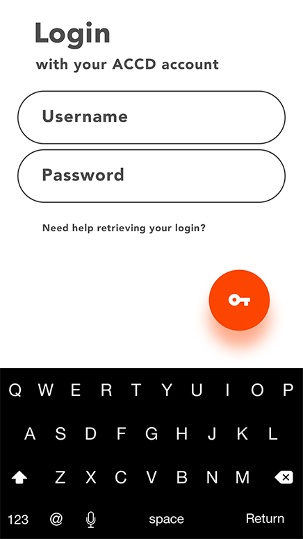
Instead of using yet another account to manage alarms, the Awake app would utilize students’ current ArtCenter portal account. This SSO (single sign-on) solution elegantly streamlined the alarm creation process.
#1
Login to sync alarms
This is neat! I wonder why no one has thought of doing this before.
Dev, Product Design Student
#2
Form inspired by function
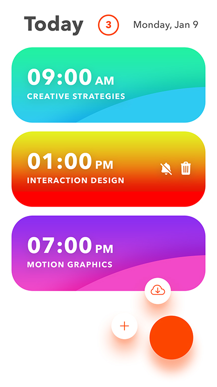
Beautifully designed alarms.
Teri, Environmental Design Student
access_time
An alarm app that notifies you of class time
event_available
with zero or minimal setup.
Awake
Being on time is the first indicator of professionalism.
keyboard_arrow_up Be up on time
keyboard_arrow_up Be better at what you do
Be prepared keyboard_arrow_down
Sign in with your ArtCenter student account to sync class schedules.

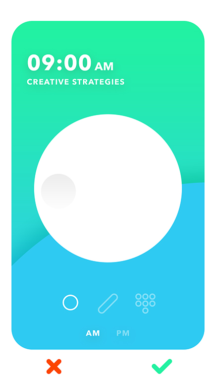
Review and adjust alarms to fit your personal needs.

The app learns your waking up pattern and helps you make proper improvements.

How it works
An alarm clock with memory.
Adaptive Intensity learns your waking up pattern and helps make adjustments to improve it.
arrow_downward
Heavy Snoozer
Rapid Riser
Lethargic Laggard
100%
80%
60%
40%
20%
0%
6:30 am
6:45 am
7:00 am
keyboard_arrow_up
Wake up time
7:15 am
7:30 am
No more rogue alarm!
Alarm Sync keeps your alarms synchronized with every new term to come.
arrow_downward
Terms
Alarms
Students
